Iota
Making food, habit, and workout tracking feel clearer without adding more noise.
Industry
Health & Wellness
Disciplines
Research & Insights
Brand Strategy
Naming
Verbal Identity
Visual Identity
Brand Collateral
Brand Guidelines
Digital Product Design
UX/UI Design
Website Design
Tracking health can become another source of pressure when the tools meant to help ask for too much attention. Iota brings food, habits, and workouts into one everyday experience, so its brand and product needed to make dense information feel easier to understand without making progress feel clinical, competitive, or loud. The experience also had to serve people with different routines and levels of commitment, offering enough structure to be useful without turning every day into a performance score.
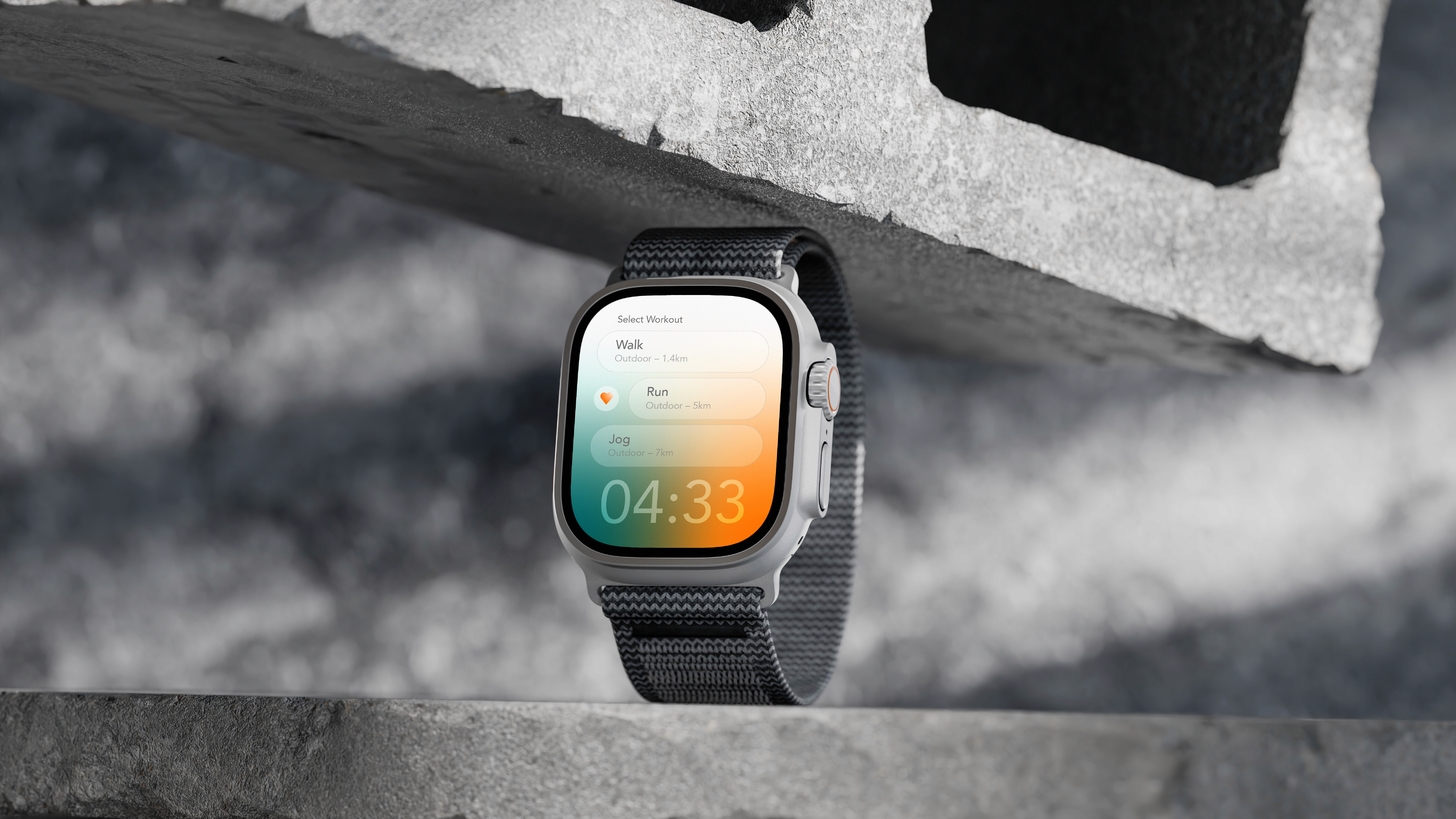
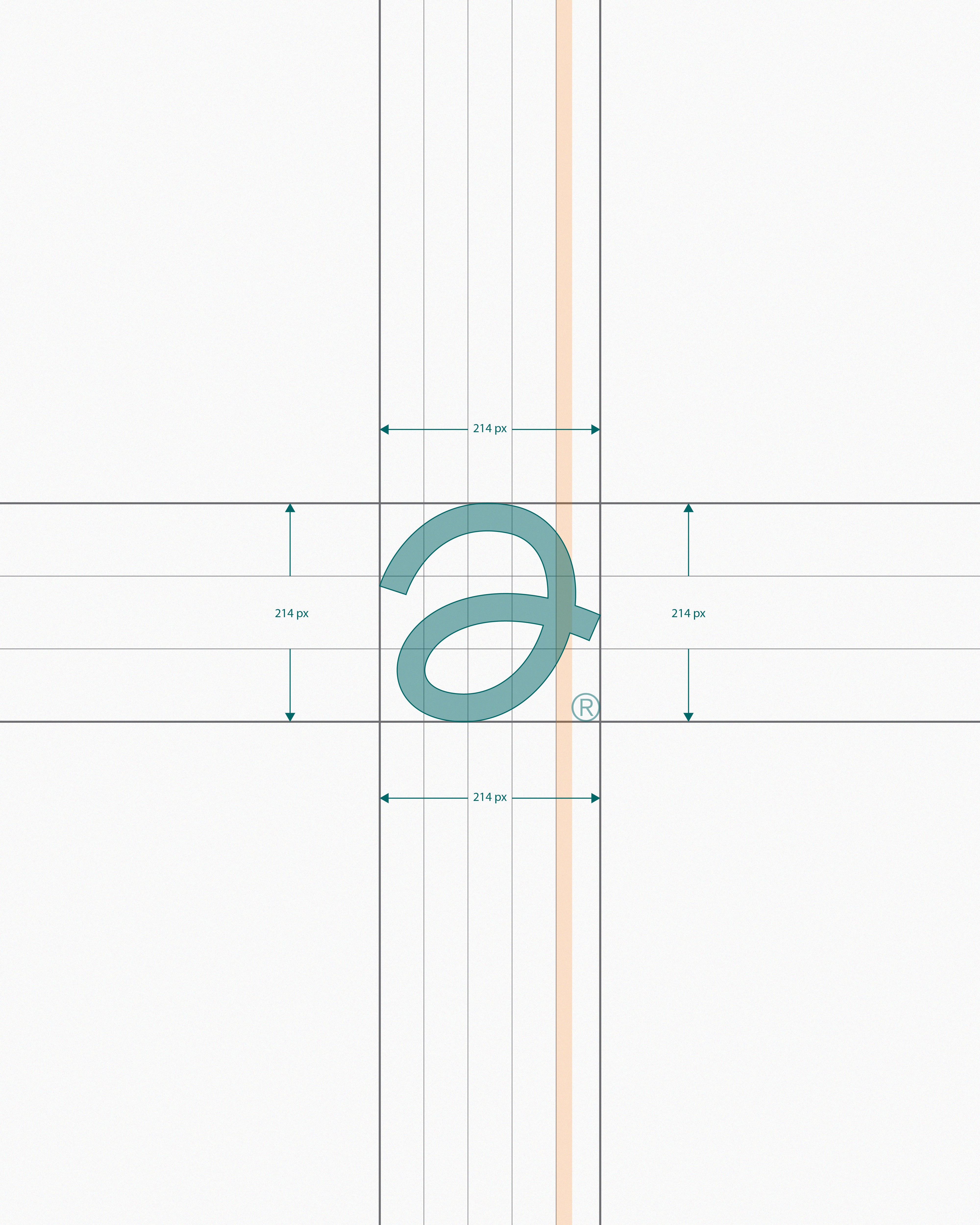
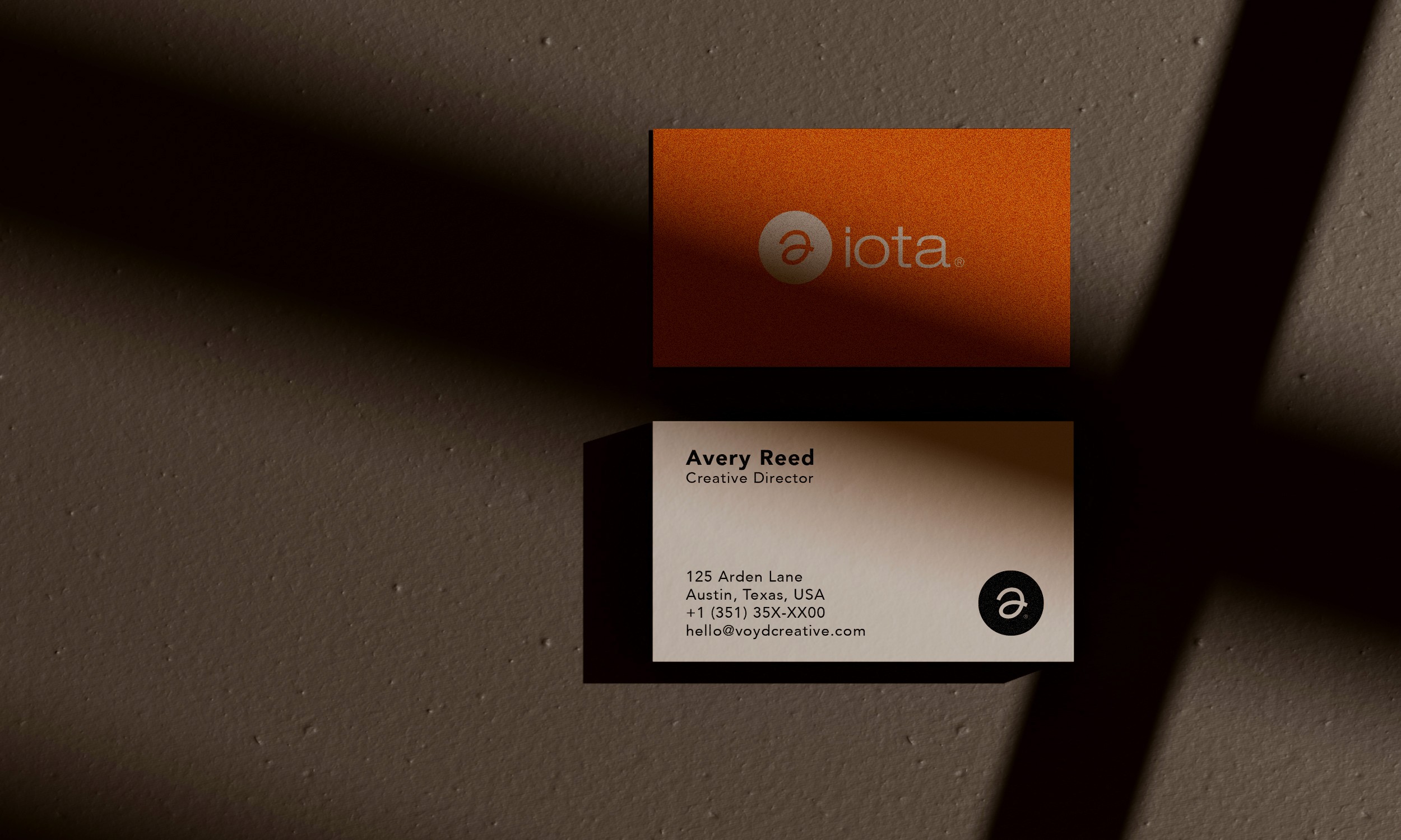
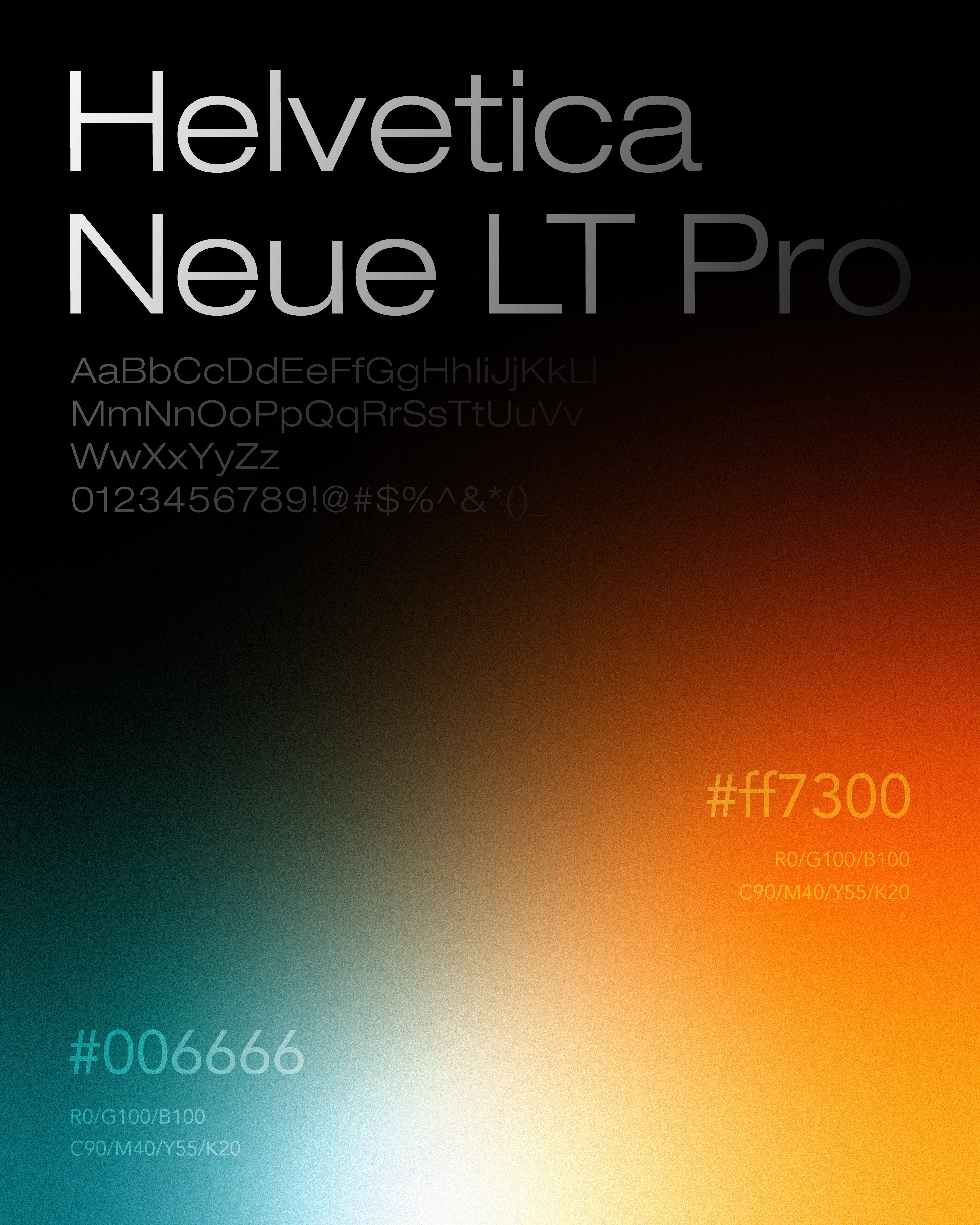
Voyd developed the identity and digital product as one connected system. Circular forms suggest continuity rather than instant transformation; energetic color brings momentum, while calm neutrals and direct typography create focus. The same principles shape the interface, linking what Iota promises as a brand with what people encounter while using it.
Across the app and website, clear hierarchy, focused pathways, and consistent visual feedback organize daily tracking without adding another layer of noise. Brand elements are not placed on top of the product as decoration—they form its underlying rhythm. Iota now has a coherent foundation across identity and experience, built around a simple human truth: meaningful progress is usually made through small actions repeated over time.